There are more than 100 halal logos worldwide (Shutterstock).

Halal Industry

A fondness for green - Halal certification logos around the world


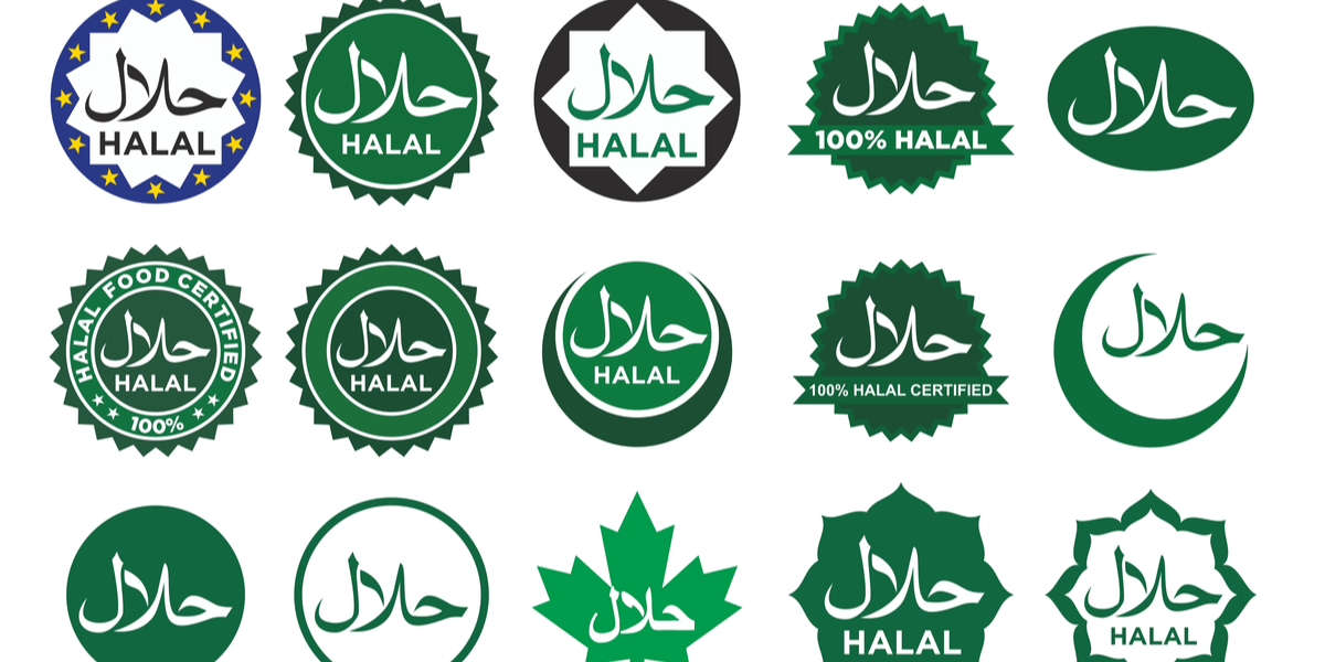
There are more than 100 halal logos globally. While not standardised, halal logos are meant to convey confidence even if the design does not always appeal.


Jakarta; Selangor, Malaysia; Dubai; Washington DC; Leicester, England; and Brussels: Halal certification systems are wildly varied, but their uniting feature is their logo use, affixed to products and buildings and used as publicity to promote the importance of their guidelines.

These symbols are important to certification bodies and significant time and imagination is invested on making them distinct, even if their designs are not universally popular.

A new halal logo launched by the Indonesian religious affairs ministry in March is a case in point with many saying it is hard to understand. Critics say the word “halal” in the new logo is hard to identify, because it is represented through stylised calligraphy, while its predecessor simply contained the word in Arabic, in green on a white background, like those found in most countries.

The new symbol was designed to recall a gunungan symbol used in the Javanese shadow puppet theatre to help audiences understand the play’s direction. However, critics have called its use in the logo “Javacentric”, deferring to Indonesia’s dominant ethnic group accounting for around 40% of the population.


Indonesia’s new halal logo halal certification label.


“We don’t think it’s a problem how it looks – it’s just a label – but we have listened to inputs from many parties including branding experts,” said Mastuki, head of the Centre for Halal Registration and Certification at the Halal Product Assurance Organising Agency (BPJPH - Badan Penanggulangan Jaminan Produk Hala).

“We’ve done our research on halal logos around the world. We wanted the new logo to reflect an Indonesian identity,” Mastuki, who like many Indonesians uses just one name, told Salaam Gateway. “The shadow puppet is an Indonesian identity, not just Javanese and it’s our cultural heritage.”

Mastuki said the new logo took effect on 1 March, but products could still use the old logo for another five years. This is particularly relevant in Indonesia, as the Halal Product Assurance Law (Undang-Undang Jaminan Produk Halal), passed in 2014, stipulates effective October 2019, products such as food, cosmetics and medicines must undergo a certification process into whether or not they are halal, thus permissible under Islamic law, and labelled accordingly.

Tulus Abadi, the head of the Indonesian Consumer Protection Foundation, said the new logo was “not informative”.

“(It) is extremely different from the old one. Its colour and design are a departure from commonly recognised halal logos,” he told Salaam Gateway, adding this could cause confusion as a common feature was needed for consumers to recognise a halal logo.

Indonesian graphic designer @NeoNetizen was unimpressed and in March tweeted: “Russia’s halal logo doesn’t feature a bear, Korea’s doesn’t feature K-pop, Rome’s doesn’t feature Roman script. Why does Indonesia’s feature ‘wayang gunungan’?”

The same question might be asked of the Muslim Professional Japan Association (MPJA), whose logo features a snow-tipped black Mount Fuji against a red background.
 

The MPJA's website explains the association's logo - 1. Mount Fuji with a white-colored peak in the centre of the logo. 2. The Arabic word ‘Halal’ at the centre of the logo. 3. The oval logo contains the word “Muslim Professional Japan Association” and “Halal For All MPJA”. 4. One small five-pointed stars placed at the bottom of the logo to separate the “moto” and “MPJA” word.


Read - Indonesian university in Malaysian tech collaboration to ease halal certification

Read - Indonesia launches free halal certification programme for small businesses

Read - Indonesia launches programmes to develop Sharia economy


Global halal logo trends

There are more than 100 halal certification logos worldwide – one for each certification body whose auditors ensure the products bearing their labels truly comply with Islamic production principles. The majority of halal certification bodies are private, although in Muslim-majority countries many are often affiliated to the state or government run. While many are for food and drink products, some halal certification bodies, such as the Dublin, Ireland-based Department of Halal Certification Europe (DHCE), also certify cosmetics and pharmaceutical products.

“Every halal certification body has its own reputation and credibility globally. There is no uniform logo. There should be ideally, but this would require a global halal standard, which there is not, said Shaykh Umar Al-Qadri, quality control director for the DHCE.


Read - Seeking accountability and transparency: Is it time for global oversight of halal certification bodies?

Read - To acquire or not to acquire – the great cosmetics halal certification debate


Most logos feature either (or both) the Arabic and Romanised wording for “halal”. Having the Arabic means “straight away you see products are halal,” said Shaykh Al-Qadri.

He added while the DHCE name provided credibility to a halal certification, they were not focused on standing out from competitors.

Unsurprisingly, most halal logos are at least partially green with UK-based DHCE auditor Mohammed Masood Abid telling Salaam Gateway “green is the colour of Islam”.


Department of Halal Certification Europe.

According to Egypt’s primary Islamic authority Dar al-Ifta, green symbolises prosperity and a good life and is mentioned in the Quran as “the colour of the garments and cushions of the people of paradise”.

In Europe, blue is another choice as it reflects the European Union’s blue flag with gold stars. Both the Halal Food Council of Europe (HFCE) and EuroHalal logos feature blue lettering on a white background.

Most Muslim countries also have regulatory standards on logo use and halal certification, notably the Malaysian Standard on Halal Food (MS 1500:2009), the Singapore Muis Halal Standards (SMHS) and the Pakistan Standard for Halal Food Management System (PS 3733:2019).


Malaysian Islamic Development Department (JAKIM)


Malaysia

Malaysia’s official halal logo is designed to be internationally recognisable and indicates a product or business has been certified halal by the Malaysian Islamic Development Department (JAKIM – Jabatan Kemajuan Islam Malaysia). Introduced in 2003, the current logo is a circle with the Arabic for halal in the centre and rung by the word “Malaysia” to streamline its authenticity, rather than JAKIM that international consumers may not know or understand.

Within the circle, two stars with five vertices on the left and right separate the words Malaysia and 'ماليزيا' - Malaysia in Arabic. Below the circle, two lines can be inserted indicating the relevant Malaysian standards for halal certification, for example MS1500:2009 refers to its halal food standard.

The line below shows a product’s unique number linked to an application for authorisation from JAKIM. This logo replaced an older version where halal was written in green and in Arabic, encapsulated in a circle.


Read - Malaysia’s JAKIM opens public consultation on recognition of foreign halal certification bodies


Egyptian Organisation for Standardisation and Quality.


Egypt

In Egypt, designers have plumped for a more figurative design for the mark used by the ministry of trade and industry’s Egyptian Organisation for Standardisation and Quality (EOS) responsible for issuing licenses of halal certification. The logo features the word “halal” in Arabic, artistically drawn in the shape of a mosque that includes a minaret topped with a crescent moon.


Read - Egypt’s halal certification rules slammed by dairy industry

Read - Egypt’s official halal certification body to open offices in five new countries


The artwork sits inside an eight-pointed star that can be found on several emblems and flags of Muslim countries and is ingrained in Islamic art and architecture, according to Teik-Cheng Lim, associate professor at Singapore University of Social Sciences.

The halal mark is only issued for products destined for export outside Egypt with everything sold domestically deemed halal by default. Hence, the country’s name in English is clearly included in the design.

In its conditions for using the halal mark, the EOS states the logo can be used in advertisements for an associated halal-certified product, but cannot be used on office walls, cargo trucks or company documents. It also cannot be used in a size smaller than 1cm2.


Emirates Authority for Standardization & Metrology (EMSA).


United Arab Emirates

The Emirates Authority for Standardisation and Metrology (ESMA) is responsible for issuing halal certification and the Halal National Mark (HNM). ESMA’s mark is the only halal logo allowed to be used in the UAE and is recognised in all Gulf Cooperation Council (GCC) countries as well as Malaysia.

The UAE Halal National Mark design is simple and features the distinctive crescent moon, in an orange polka dot format, an internationally-recognised symbol of Islam, encompassing the word “halal” in English and Arabic. It does not denote the UAE as the origin of exported products.


Read - UAE launches integrated ‘Arab system’ for mutual recognition of halal certificates

Read - Q&A with Ali Hussein El Zoghbi, VP of Brazil’s FAMBRAS, South America’s largest halal certifier


International Halal Certification Ltd (IHC).


Pakistan

The International Halal Certification Ltd (IHC), an agency accredited by the Pakistan National Accreditation Council (PNAC), issues halal certification and halal marks for companies globally. Like ESMA’s halal national mark, the IHC also uses a crescent moon in its design with an affirmative check mark to denote quality assurance. “International Halal Certification” is fully typed out in Arabic and English to show the IHC’s global scope and halal appears in a red font to stand out from the rest of the text.
 

Halal Research Council.


Lahore, Pakistan-based Halal Research Council chief executive officer Muhammad Zubair Mughal agreed a logo should be clear and easy to understand.

However, he is concerned that around 80% of global halal logos use Arabic, a problem given many Muslim consumers cannot read Arabic – especially in Latin America and Europe. He argued the ideal strategy would be to use the local and Arabic languages in the logo – the Halal Research Council logo uses Arabic and English, which is co-official with Urdu in Pakistan.


American Halal Foundation.


USA

Mohammad A Hussaini, vice president at the American Halal Foundation (AHF) in Bolingbrook, Illinois, believes many halal logos are too complicated. This includes the AHF’s old logo that displayed an H inside a star, inside a black square, inside a circle of words.

The new logo is simpler – an H inside a traditional eight-pointed star in black or green. As well as looking cleaner, he said it met the organisation’s goal of being immediately recognisable to consumers.

“It has an Arabic element (the star) to show the traditional heritage. We pay homage to that.”

The design also pays attention to producers’ needs, he added. “When you have a brand, you want that brand to be full front and centre. The logo disc is simple, not drawing attention away from brand.”


The Islamic Food and Nutrition Council of America (IFANCA).


The Islamic Food and Nutrition Council of America (IFANCA) also takes producers’ needs into account with its logo, said Muhammad Munir Chaudry, the organisation’s president. It offers variations on the logo to accommodate different packaging sizes.

The heart of the IFANCA logo is the Islamic symbol crescent moon, but Chaudry said it was designed not to appeal exclusively to Muslims.

“When you put more words in, you make it narrow. Halal is good for you. We look at how it is produced; that it has good manufacturing practices (and) no harmful ingredients. Halal is for all.”


Read - America: To halal or not to halal? Interview with Dr. Muhammad Munir Chaudry, IFANCA President and CEO

Read - Virtual halal audits during COVID-19 on ‘case-by-case basis’, says IFANCA

Read - IFANCA® and UNICEF USA team up to address health security


Halal Certification Organisation (HCO).


UK

According to Amer Rashid, technical director at Birmingham, England-based Halal Certification Organisation (HCO), the ideal halal logo design should be simple with a clear message. The logo has three main purposes: a simple and recognisable form; proving the product is halal certified and showing which organisation had certified the product.

Accordingly, he said the HCO logo clearly states the organisation’s name and values and includes the words “halal”, “healthy” and “hygienic”

“These are all very important because these things are exactly what a halal product should be,” he said.


Halal Monitoring Committee (HMC).


Nadeem Adam, the operations director of another UK-based halal certifier, the Halal Monitoring Committee (HMC), agreed, indicating a halal logo should be simple and clear and the sign uphold halal provenance.

He said although the HMC was globally recognised, its core recognition was in the UK and consequently the organisation had opted for the current design as it encompassed the core value of monitoring.

“This is what HMC does – monitoring the halal supply chain in real-time for meat and poultry products,” he added.

© SalaamGateway.com 2022. All Rights Reserved


tags:

halal food, halal beverages, dinar, sparkingling wine, halal
Halal audit
Halal certification
Halal logo
Author Profile Image
Ahmad Pathoni, Ushar Prakash Kaur Daniele, Heba Hashem, Stephenie Overman, Poorna Rodrigo, Sara Lewis